

Learn how to create a user friendly website with clear navigation, mobile usability, useful content, trust signals, and effective calls to action.
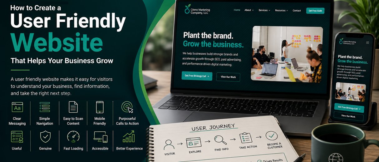
A user friendly website makes it easy for visitors to understand a business, find information, navigate between pages, and take the right next step. Clear navigation, readable content, mobile responsiveness, useful calls to action, and a logical page structure are key elements of a website that supports a better customer experience.
A website can look modern and still be difficult to use.
Visitors may struggle to find a service, understand what a business offers, or figure out how to contact the company. On mobile devices, the same website may become even harder to navigate.
A user friendly website is designed around the needs of the people using it.
Instead of asking only whether a website looks attractive, businesses should also ask:
Good usability helps remove unnecessary friction from the customer journey.
People visit business websites with specific goals. They may want to learn about a service, compare options, read customer experiences, find contact information, request a quote, or make a purchase.
If a website makes these tasks difficult, visitors may leave before becoming leads or customers.
A user friendly website creates a clearer path between discovering a business, understanding its offering, building trust, and taking action.
This is especially important for businesses where customers research their options before making a decision. The website can become an important part of that research process.
Your homepage should quickly communicate what the business does, who it serves, and what visitors can do next.
Avoid vague headlines that sound impressive but don’t explain the actual offering.
For example, a business website should make its core service clear rather than forcing visitors to scroll through several sections to understand what the company provides.
Clear messaging gives visitors a reason to continue exploring.
Navigation should help visitors find important information without making them think about where to click.
Common sections may include:
The exact structure depends on the business.
The important principle is to keep the most useful destinations easy to reach and avoid filling the main menu with unnecessary choices.
Most visitors scan a webpage before deciding whether to read it fully.
Make important information easier to find with:
Headings should tell visitors what information they will find in each section.
A well organized page can make complicated information easier to understand without adding unnecessary design elements.
A professional website should work properly across smartphones, tablets, and desktop screens.
Mobile visitors should be able to:
Mobile usability should be considered during the website development process rather than treated as a final check after the desktop design is complete.
Visitors should understand what they can do next.
Depending on the page, a call to action could be:
The CTA should match the visitor’s intent.
An educational blog may guide visitors toward another useful resource, while a service page may encourage them to request information or contact the business.
The goal isn’t to add a sales message everywhere. It is to make the appropriate next step clear.
Contact forms should request information that is genuinely necessary.
A consultation form might need a name, email address, company information, and project details. Adding unnecessary fields can create extra friction.
Before publishing a form, ask:
“Do we really need this information at this stage?”
If the answer is no, consider removing the field.
Visitors want to know whether they can trust a business before taking action.
Relevant trust signals can include:
These elements should reflect genuine experience. Adding exaggerated claims or generic badges won’t create meaningful trust.
If an existing website isn’t easy to use, you don’t necessarily need to redesign everything at once.
Understand who the website is primarily designed for and what those visitors need.
Think about what potential customers need to know before contacting or purchasing from the business.
These questions can guide both content and page structure.
Identify common paths visitors may take.
For example:
Homepage → Service → Case Study → Contact
Or:
Google Search → Blog → Service Page → Consultation
The goal is to make these journeys easy to follow.
Ask someone unfamiliar with the business to complete simple tasks, such as finding a service or locating contact information.
Their difficulties can reveal problems that an internal team may overlook.
Look for confusing navigation, duplicate information, long forms, unclear language, or distracting elements.
Often, improving usability means simplifying the experience rather than adding more features.
A website can focus too heavily on what the company wants to say instead of what customers need to know.
Creative headlines can look attractive but leave visitors unsure about the actual offering.
Too many menu options can make it harder for visitors to find important information.
A website should be tested on smartphones as well as desktop screens.
Large walls of text can make information difficult to scan. Break content into useful sections.
Multiple competing actions can make it difficult for visitors to decide what to do next.
Keep these principles in mind when designing or improving a business website:
A user friendly website doesn’t follow one universal design formula. It responds to the needs of its specific audience.
Before launching or redesigning your website, ask:
A user friendly website allows visitors to understand a business, find information, navigate pages, and complete relevant tasks without unnecessary difficulty.
Clear content, logical navigation, responsive design, useful functionality, and a straightforward customer journey all contribute to usability.
Simplify navigation, improve content structure, make the site mobile friendly, clarify calls to action, and remove unnecessary steps.
People access websites from different devices, so a poor mobile experience can make important information and actions difficult to access.
Organize navigation around the information visitors need most. Use clear labels and avoid unnecessary choices.
Important pages should provide an appropriate next step, but not every page needs an aggressive sales message.
Ask people unfamiliar with your business to complete common tasks and observe where they struggle.
Yes. A simple website can be effective when visitors can easily find information and complete the actions they came to perform.
Usability and SEO are different disciplines, but clear structure, accessible content, mobile usability, and logical navigation can support a better website experience.
Review usability when making major changes and periodically as customer needs, services, and business goals evolve.
A user friendly website doesn’t need to be packed with features.
It needs to help the right visitors find information, understand the business, build confidence, and take the appropriate next step.
Start with clear messaging, simple navigation, useful content, mobile usability, practical forms, genuine trust signals, and purposeful calls to action.
Then test the experience with real users. Their perspective can reveal problems an internal team may not notice.
When usability becomes part of the website strategy from the beginning, a website can become more than an online presence. It can support customer education, lead generation, and long term business growth.
Citeno Marketing develops websites and landing pages with a focus on performance, user experience, and business objectives, helping businesses build a stronger digital foundation.

Book a free strategy call and let's talk about your goals.
Book Free Strategy Call